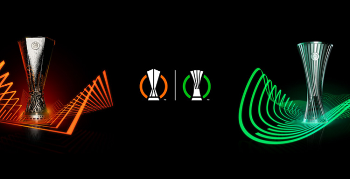
The Europa League was founded in 1971 and is the second-tier of European club football after the Champions League. This year sees the league restructured, however, with the number of teams involved streamlined from 48 to 32.
A new third-tier competition for a further 32 teams is being established this year as well: the UEFA Europa Conference League.
Pentagram diseña el trofeo de la UEFA Europa Conference League https://t.co/V40xFEPmt6 pic.twitter.com/bobXQ1i1Y9
— Gràffica (@graffica_info) June 22, 2021
Two new logos have also been drawn up. The UEFA Europa League logo uses angular geometry, which mirrors the design of the competition’s trophy. Meanwhile, the new UEFA Europa Conference League logo features curved geometry, in line with the new competition’s more “fluid” trophy.
Beyond the shapes, the two logos are differentiated by colour. The Europa League branding retains its orange colour, though this has been refined, according to Mapp, as there were too many variations previously.
The Conference League uses a bright green colour – this allows the brand to “stand out” from its “sibling”, while still “matching the same energy” with a bright colour Mapp says.
The logos will feature alongside the branding across a wide range of touchpoints. These will include social media, brand communications, stadium perimeter boards, merchandise and broadcast graphics.
⚽ 𝗛𝗼𝘄 𝘄𝗶𝗹𝗹 𝘁𝗵𝗲 𝗻𝗲𝘄 𝗨𝗘𝗙𝗔 𝗘𝘂𝗿𝗼𝗽𝗮 𝗖𝗼𝗻𝗳𝗲𝗿𝗲𝗻𝗰𝗲 𝗟𝗲𝗮𝗴𝘂𝗲 𝘄𝗼𝗿𝗸?
🤝 184 teams
🌍 55 member associations represented
🔀 46 clubs transferring from either the #UCL or #UEL.🏟️ First final: 25 May 2022 in Tirana, Albania.
— UEFA (@UEFA) May 24, 2021
Some elements of the previous Europa branding have been reused for the two new looks. The music developed for the original competition has been extended to the new Conference League – this has created an “anthemic experience” Mapp says.
Additionally, the brand typefaces, Europa Title and Europa Nuova, have been retained by Turquoise. Initially, there was talk of introducing a new typeface to differentiate between the two tournaments, but Mapp says this was decided against in the interest of “visual cohesion”.
However, other elements have been reworked. Mapp says the UEFA Europa League logotype is one example.
“We needed to ensure that the design of the new logotypes were optimised for use as on-screen bugs within the match graphics and as avatars within social media,” he says.
“We ended up creating a simpler and bolder logotype system that worked across both competitions.”
In the same vein as the logo, the logotypes take their inspiration from the different angles of the competition trophies.
“The end result is a set of logotypes that now work perfectly at small sizes in both digital and broadcast media,” Mapp adds.


